Design & Layout
We will use a very simple layout style that conforms to users' expectations. Design should be clean and modern, and minimal.
Colours will be kept to a minimum, with the logo blue as the primary, and the logo red as the secondary. The only other colours will be shades or tints of these. Gradients should not be used except for buttons and other special highlights.
The exception is for alerts, warnings, or information boxes, where appropriate colours for the type of information can be used.
Typography should be optimised for readability and accessibility. We will follow gov.uk's lead and use the Transport New font across the site, falling back to Arial where webfont support is not available.
For easy readability, basic font size should be 1.4rem (or 14pt), with headings scaled appropriately.
The following sites can be referred to as references for the kind of clean aesthetic design we want to acheive:
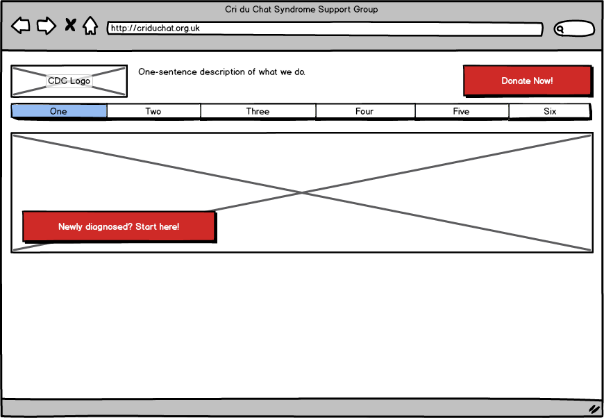
Layout is very standard, with a small header section, horizontal primary navigation, and secondary navigation in a vertical column at the left of the page. Current pages should be highlighted.
Major calls to action are highlighted with coloured action buttons. The 'Donate' button is prominent at the top right of every page, and the front page features a prominent 'start here' button for newly-diagnosed visitors.
Content pages include the secondary navigation, and a content area.

Footer is standard on every page, with three columns. First is a list of 'housekeeping' links that we don't want to clutter the main navigation with. Second is a list of social media and other site links, and the third contains legal info such as copyright, registered address, charity number etc.
We will use the Bootstrap CSS framework. This allows us to use their clean design to start with, then customise later when we wish to have more control over appearance.