Support customizable, complex transitions that animate individual views on a screen #175
Comments
|
I'm excited to see progress on the shared element transitions! The described API seems problematic to me because Instead, maybe you could render something like this: <SharedElement id={`image-${photo.url}`}>
<Image />
</SharedElement>This element would use context to communicate with the navigator about layout and animation. |
|
@ericvicenti Hmm, I thought the prop will be stored in the React element even if it's not declared in propTypes? I was able to see any arbitrary prop passed into the component in my debug logs. Yup wrapping it in a custom component was my approach described in the blog. I was hoping to simplify it more. :) But this way looks more hopeful to implement than the tricky tree traversal. I call it <TransitionView id={`image-${photo.url}`}>
<Image />
</TransitionView> |
|
@ericvicenti I fleshed out the API a bit more. It seems fairly doable now. Let me know what you think! |
|
I really like the idea of having Maybe this could be added as a feature of |
|
@ericvicenti It's indeed an ambitious goal to support generic transitions. Would you mind elaborate which parts of the API look tricky and why? |
|
The concept of a |
|
I think we can define Under the hood, we could reuse most code of const Slide = (filter) => (duration) => (
{
createAnimations(viewsOnFromRoute, viewsOnToRoute) { ... }
}
);
const SlideScene = Slide('$sceneRoot');
const FadeScene = Fade('$sceneRoot');
const transitions = [
{from: "PhotoGrid", to: 'PhotoDetail', transition: together(SlideScene(), sq(Idle(0.3), FadeScene()))},
]Does this make sense? |
|
I am still a bit confused. What would the CardStack component look like, if it was built out of TransitionViews? I was expecting your example to have JSX. |
|
What about this? Basically wrapping existing scenes/header with class CardStack {
_render(props) {
....
return (
<View>
<View>
{props.scenes.map(scene => (
<Transition.View id={`$scene-${scene.route.routeName}`}>
{ this._renderScene(...) }
</Transition.View>
))}
</View>
{
floatingHeader && (
<Transition.View id="$floatingHeader">
{ floatingHeader }
</Transition.View>
)
}
{ transitionOverlay }
</View>
)
}
} |
|
Update: I'm working on a proof of concept here: lintonye/react-navigation@master...multi-transitions Haven't got it fully working yet, but it still seems doable. The API is fairly close to what's specified above except that I haven't started on transition composition yet. Example: shared elements transition You can see that I'd appreciate any feedback if you could take a quick look (or maybe if you could spot silly errors etc.). |
|
This is coming together in the branch above. Here are a couple examples:
Of course there are quite a few glitches that need to be fixed, and the API needs some more clean up. But I'd accept this as a proof of concept. I'm running out of time this week. Hopefully will get back to this next week. Let me know your thoughts! |
|
More updates. I managed to fix most glitches and the animation looks much better now! I also started the Here's a demo: https://youtu.be/1wW7CTWtSME, and in slow-mo: https://youtu.be/aBCeNxsULso Notice the subtle difference between the enter and exit transitions. All it takes to implement this is the code below: const SharedImage = initTransition(Transitions.SharedElement, /image-.+/);
const CrossFadeScenes = initTransition(Transitions.CrossFade, /\$scene-.+/);
const ScaleFab = initTransition(Transitions.Scale, /fab-.+/);
const Idle = initTransition(createTransition({}), /x/);
const transitions = [
{
from: 'ProductGallery', to: 'ProductDetail',
// [ SharedImage(0.7), 0.5 => CrossFadeScenes(0.2))] => ScaleFab(0.3)
transition: sequence(together(SharedImage(0.7), sequence(Idle(0.5), CrossFadeScenes(0.2))), ScaleFab(0.3)),
config: { duration: 5800 },
},
{
from: 'ProductDetail', to: 'ProductGallery',
transition: together(SharedImage(1), CrossFadeScenes(0.2), ScaleFab(0.3)),
config: { duration: 5450 },
},
];How do you like it? |
|
@lintonye, as a potential consumer of the API (and not a contributor) this looks very elegant. Great work! |
|
I see your updated proposal at the top of this issue, and it looks very powerful! But I am concerned about the added complexity. It looks like a very tricky API to learn. What if we started by adding shared elements, and eventually consider adding cc @brentvatne, @satya164, @grabbou |
|
@ericvicenti Thanks for the feedback. I understand your concern if you meant the added complexity in the implementation. It sounds a good approach to release the shared elements first to help stabilizing the implementation before exposing Regarding the learning complexity though, which part do you find tricky to learn? I'd appreciate some detailed feedback and suggestions. As far as I can see, for doing the same thing (i.e. choreographing custom transitions), this API is way easier than the current approach of rolling up custom transitioners. What's the best approach to test the learnability? I guess we'd have to get people to use it somehow? |
|
@lintonye looking good to me so far! Any word on this? |
|
It indeed does look good and I personally dont feel the API overwhelming or complicated. The surface API seems to capture just what is needed and in a pretty expressive / declarative manner which is a good thing imho. |
|
Thanks for the feedback @getnashty @tlvenn. My schedule was packed last couple of weeks, which should improve starting this week. I'm planning to get back to this and create a PR with shared element transition first, and then figure out how to roll out the more general API (suggestions welcome). |
|
Any updates? |
|
Shared element transition PR created! Feedback welcome! |
|
The shared element transition PR also includes an implementation of the custom transition API as described in this issue. Feel free to play with it and I'd appreciate your feedback. I should warn you though that the API is highly subject to change and there are bugs all over the place. :) Have fun! |
|
@voidstarfire maybe this can help you, it works on Android, but for all stack. |
|
Dumb questions
I found this issue from other issues which been closed because of |
|
Thanks for the great work. Do you know if the PR will be accepted soon ? |
|
@dannycochran hey, can i use |
|
@lintonye what is the status on this? Are you still working on it? |
|
Wow, its been almost 6 months... |
|
@farzd, with all due respect, let’s keep it constructive. |
|
any status update on shared element transitions? |
|
Can we please get an update on this? |
|
For updates refer to #2585 |
|
Thanks @kelset for the update. I'm excited about the new roadmap, and I am
keen to restart my effort on transitions!
IMHO a good first step is to review the API proposal above and let me know
your thoughts. I've got some new ideas but it'd good if we have a good
discussion about the current ideas first.
…On Oct 7, 2017 11:56 AM, "Lorenzo Sciandra" ***@***.***> wrote:
For updates refer to #2585
<#2585>
—
You are receiving this because you were mentioned.
Reply to this email directly, view it on GitHub
<#175 (comment)>,
or mute the thread
<https://github.com/notifications/unsubscribe-auth/ABBBU9IUYnwN3hQQlUI0npXcP60lNBTfks5sp8lggaJpZM4L2-Pw>
.
|
|
@lintonye I only want to remove animate when call navigation.navigate(). It is same as navigation.pushViewController(controller: A, animate: false) in iOS. Can you help me? |
|
@lintonye - I know this is a year old and you may not be interested anymore, apologies for the lack of management on this project over the last year. if you are still wanting to push this through, could you re-create this RFC on https://github.com/react-navigation/rfcs please? |
|
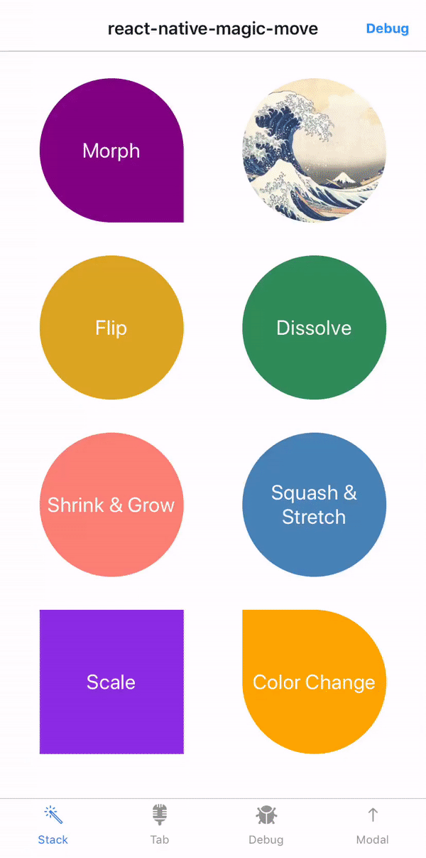
Hi guys, please have a look at https://github.com/IjzerenHein/react-native-magic-move
|
 and others
Update March 8, 2017: This RFC is based on an experimental implementation at lintonye/react-navigation@master...multi-transitions
Motivation
So far we only support simple transitions that animate the entire screen. It's desirable to allow highly customizable transitions that animate individual views on the screen. The shared elements transition is an example of this. It'd be fun if we could easily implement this or this.
The last two examples are perhaps difficult to implement even in native code where the APIs are not always straightforward to use. It'd be great if we could have a declarative API in RN to simplify that!
Proposed API
I'm hoping to minimize the impact on the code unrelated to transitions. We should be able to code our components as usual, and add some special markups to pick out the views we want to animate.
A simple example
Dissecting the example
1. Apply a regex to "bind" a transition
This creates a transition bound by the given regex. The created transition is only effective on "transition views" (see 4 below) with a matching id.
See the section "Discussions" at the end about why a regex is used.
2.
transitionsconfiguration innavigationOptionsWe can declaratively specify
transitionsthat originate from a screen:Perhaps
transitionscan be a function to allow more dynamic definitions:3. Transition duration and Composition
Transitions can be composed using
sequence()andtogether().Bound transitions such as
sharedImagesandcrossFadeScenesare functions that take adurationRatio: numberparameter. ThedurationRatiois between 0 and 1 and defines the relative time the transition will play. The actual play time =config.duration * durationRatio.If
durationRatiois omitted, the transition will stretch till the end of the entire transition. For example, insequence(sharedImages(0.8), crossFadeScenes()), thedurationRatioofcrossFadeScenes()is0.2, whereas intogether(sharedImages(0.8), crossFadeScenes()), it's1.4. Marking up "Transition Views"
Transition views are the views that are animated during transition.
The
Transition.*components mirror theAnimated.*components and API:The only extra prop that a
Transition.*component accepts isid: string, which is used by transitions to filter views that they want to animate.The following transition views with special ids are already created in a CardStack:
$scene-${routeName}: the root view of each scene$header-${routeName}or$header: the header on each scene, or the floating header if the headerMode isfloat$overlay: the root of the overlay created during transition if any transition views are configured to be cloned.Creating custom transitions
Then,
MyTransitioncan be bound with a regex and used innavigationOptions:1.
getItemsToCloneThis function returns an array of
TransitionItems, selected fromitemsOnFromRouteanditemsOnToRoute.When a
TransitionItemis included in this array, its associated react element will be cloned on to an overlay that sits on top of everything. The overlay is only visible during the entire transition process (i.e, visible only whenprogressfalls in(0, 1)).No overlay will be created if none of the configured transitions specify at least one item to clone.
2.
getItemsToMeasureThis function returns an array of
TransitionItems, selected fromitemsOnFromRouteanditemsOnToRoute.When a
TransitionItemis included in this array, it will contain a propmetrics: {x: number, y: number, width: number, height: number}when it's passed intogetStyleMap. Currentlymetricsonly includes the view's location in the window, but perhaps its location in its parent can be included as well.Keep the number of items to measure small because the measuring process is slow which could cause the transition to lose frames.
3.
getStyleMapThis is the main function that animates the transition views. It returns a
TransitionStyleMap, whose shape is something like this:fromandtoare two fixed keywords that tell if the concerned transition views are on the "from route" or "to route".<Transition.Image id="image1" />Animated.Value, we just specify the parameters here. Under the hood, the transition library merges the ranges and creates anAnimated.Valueby interpolatingposition.inputRangeshould be between0and1. The default is[0, 1].scaleandtranslateXshould be directly set here instead of embeded in atransformarray.Note, if an item is cloned, the library will always hide it during the transition regardless of the style returned from this function. This avoids showing duplicated views due to the clone on the overlay.
4.
getStyleMapForClonesThis function works in the same way as
getStyleMap, except that it animates clones on the overlay. It will only receives items returned fromgetItemsToClone().5.
canUseNativeDriverIn a transition composition, this returns
trueonly if all sub transitions returntrue. If this function isn't deinfed, it's default totrue.Discussions
Use of regex
A regex is used to select transition views instead of just a string because:
crossFade(/\$scene-.+/)instead ofcrossFade('$scene-route1'),crossFade('$scene-route2'), ...However, @ericvicenti expressed concerns about its impact on static analysis and developer ergonomics. Please comment if you have similar or other concerns.
Make
SharedElementtransition defaultSince shared element is such a popular transition, we could consider to make it default whenever the app developer specifies a shared element.
sequence(sharedElement(0.8), crossFadeScenes(0.2))andtogether(sharedElement(1), crossFadeScenes(0.2))on the Back direction. Note thecrossFadeScenestransition is necessary for the transition to look good.Transition.Shared.Imageis used, and no other transitions specified, we'll run the default CardStack transitions as implemented right now.One downside: if the user defines a custom transition, the default sharedElement transition will not run even though the view is marked as
Transition.Shared. This could cause confusions. But I think it should be minor since the developer is already aware of creating custom transitions, hence, she should as well remove the wordSharedin the jsx.The text was updated successfully, but these errors were encountered: