fix(select): slotted label content works with outline notch #27483
There are no files selected for viewing
| Original file line number | Diff line number | Diff line change |
|---|---|---|
|
|
@@ -120,6 +120,7 @@ configs({ modes: ['md'] }).forEach(({ title, screenshot, config }) => { | |
| const select = page.locator('ion-select'); | ||
| expect(await select.screenshot()).toMatchSnapshot(screenshot(`select-fill-outline-label-floating`)); | ||
| }); | ||
|
|
||
| test('should not have visual regressions with shaped outline', async ({ page }) => { | ||
| await page.setContent( | ||
| ` | ||
|
|
@@ -167,3 +168,60 @@ configs({ modes: ['md'] }).forEach(({ title, screenshot, config }) => { | |
| }); | ||
| }); | ||
| }); | ||
|
|
||
| configs({ modes: ['md'], directions: ['ltr'] }).forEach(({ title, screenshot, config }) => { | ||
| test.describe(title('select: label slot'), () => { | ||
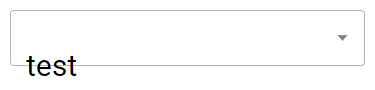
| test('should render the notch correctly with a slotted label', async ({ page }) => { | ||
| await page.setContent( | ||
| ` | ||
| <style> | ||
| .custom-label { | ||
| font-size: 30px; | ||
| } | ||
| </style> | ||
| <ion-select | ||
| fill="outline" | ||
| label-placement="stacked" | ||
| value="apple" | ||
| > | ||
| <div slot="label" class="custom-label">My Label Content</div> | ||
| <ion-select-option value="apple">Apple</ion-select-option> | ||
| </ion-select> | ||
| `, | ||
| config | ||
| ); | ||
|
|
||
| const select = page.locator('ion-select'); | ||
| expect(await select.screenshot()).toMatchSnapshot(screenshot(`select-fill-outline-slotted-label`)); | ||
| }); | ||
| test('should render the notch correctly with a slotted label after the select was originally hidden', async ({ | ||
| page, | ||
| }) => { | ||
| await page.setContent( | ||
| ` | ||
| <style> | ||
| .custom-label { | ||
| font-size: 30px; | ||
|
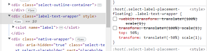
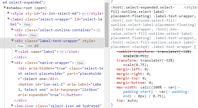
There was a problem hiding this comment. Setting this style on a floating label causes the label to render too low when the select is closed: Not sure if this is best addressed in another PR, though. There was a problem hiding this comment. This is another tricky one. The problem here is we are translating based on %, which will be based on the height of the label element. If the label element grows in height so will the translation. MDC "fixes" this by giving the label a fixed height. However, this causes the text to get cut off at larger font sizes. This also causes the label to no longer be centered in the container as the select increases in height, though I'm not 100% if that's by design. We could also make the label height 100%, but then we're going to need to translate by seemingly arbitrary values that may also be wrong as the select changes in height. Any thoughts on how best to address? I'll keep testing it. It's worth noting that Material Design doesn't seem to do a lot of customizations on floating/stacked labels beyond colors and such. Perhaps this is by design? There was a problem hiding this comment. I was able to get pretty close by changing the following styles on
The animation doesn't work right, but maybe there's a good way to fix it? An alternative could be to not do There was a problem hiding this comment. During refinement we discussed that this is the same problem as https://ionic-cloud.atlassian.net/browse/FW-4083, so we are going to handle this fix in a separate ticket. |
||
| } | ||
| </style> | ||
| <ion-select | ||
| fill="outline" | ||
| label-placement="stacked" | ||
| value="apple" | ||
| style="display: none" | ||
| > | ||
| <div slot="label" class="custom-label">My Label Content</div> | ||
| <ion-select-option value="apple">Apple</ion-select-option> | ||
| </ion-select> | ||
| `, | ||
| config | ||
| ); | ||
|
|
||
| const select = page.locator('ion-select'); | ||
|
|
||
| await select.evaluate((el: HTMLIonSelectElement) => el.style.removeProperty('display')); | ||
|
|
||
| expect(await select.screenshot()).toMatchSnapshot(screenshot(`select-fill-outline-hidden-slotted-label`)); | ||
| }); | ||
| }); | ||
| }); | ||
Uh oh!
There was an error while loading. Please reload this page.