Improve experience on smaller screens #470
Conversation
|
@stgn this looks like a nice improvement 👍 Wouldn't 1080px be a bit big if this is mainly aimed at mobile platforms? The chrome dev tools use 1024px as a "laptop" screen width, which means the average laptop would probably see part of the page pushed off the screen when the menu is open, whereas you'd typically expect it to wrap so you can see both the page content and the sidebar at the same time. |
|
@stgn, what are your thoughts on the default screen size? From what I can see that's the only question stopping us from merging this PR. |
|
Without this change, 1080px is roughly the point where the content begins shrinking and wrapping. It's also the point where the sidebar would hide itself if the sidebar state isn't explicitly set or saved. I just tried to match that. 1024px is unusually small for a laptop screen. I believe most laptops nowadays have resolutions with widths >= 1280px, with 1366px being the most common. The "Laptop with MDPI screen" preset in Chrome DevTools's device mode uses a width of 1280px. |
That sounds quite reasonable. There aren't any other outstanding questions, are there? @stgn, once the conflicts are resolved do you think this PR is ready to merge? |
 stgn
force-pushed
the
sidebar-page-ux
branch
from
stgn
force-pushed
the
sidebar-page-ux
branch
from
369d525 to
31fb443
Compare
|
That should do it. Please test it (because I don't think that one PR was). |
|
I tried this out on my laptop using chrome dev tools at both On the second recording you can see me struggling to close the sidebar once it's been opened because you can no longer pan the page. I actually needed to cheat and increase the window size to close the sidebar. In theory you could "fix" this by making the sidebar smaller so that even on the smallest realistic screen you can still see the button for closing it, but that doesn't really address the underlying problem. @stgn, what do you think we should do? master (65acb35) This PR (31fb443) |

|
The inability to pan horizontally is intentional. I originally thought about allowing it, but it's not very intuitive mobile design. There are a few ways to go about addressing this (in order of personal preference):
|
|
I think the best long-term solution would be to implement swipe gestures. As you've mentioned allowing horizontal panning isn't ideal, and reducing the sidebar width until it fits is a bit of a hack and doesn't solve the underlying problem. I don't think we had any other outstanding questions or concerns. I'm happy to merge this PR given we've got a solution in the works for closing the menu at smaller resolutions (#474). |
|
I was testing #551 on my mobile and noticed that we may have accidentally regressed on the line wrapping/overflow behaviour this PR introduced. When you open/close the sidebar it's normally meant to push the page content off screen (as introduced in this PR). However on @sorin-davidoi, thoughts? It seems like a purely CSS thing and |
|
I'll take a look later today. |
Improve experience on smaller screens
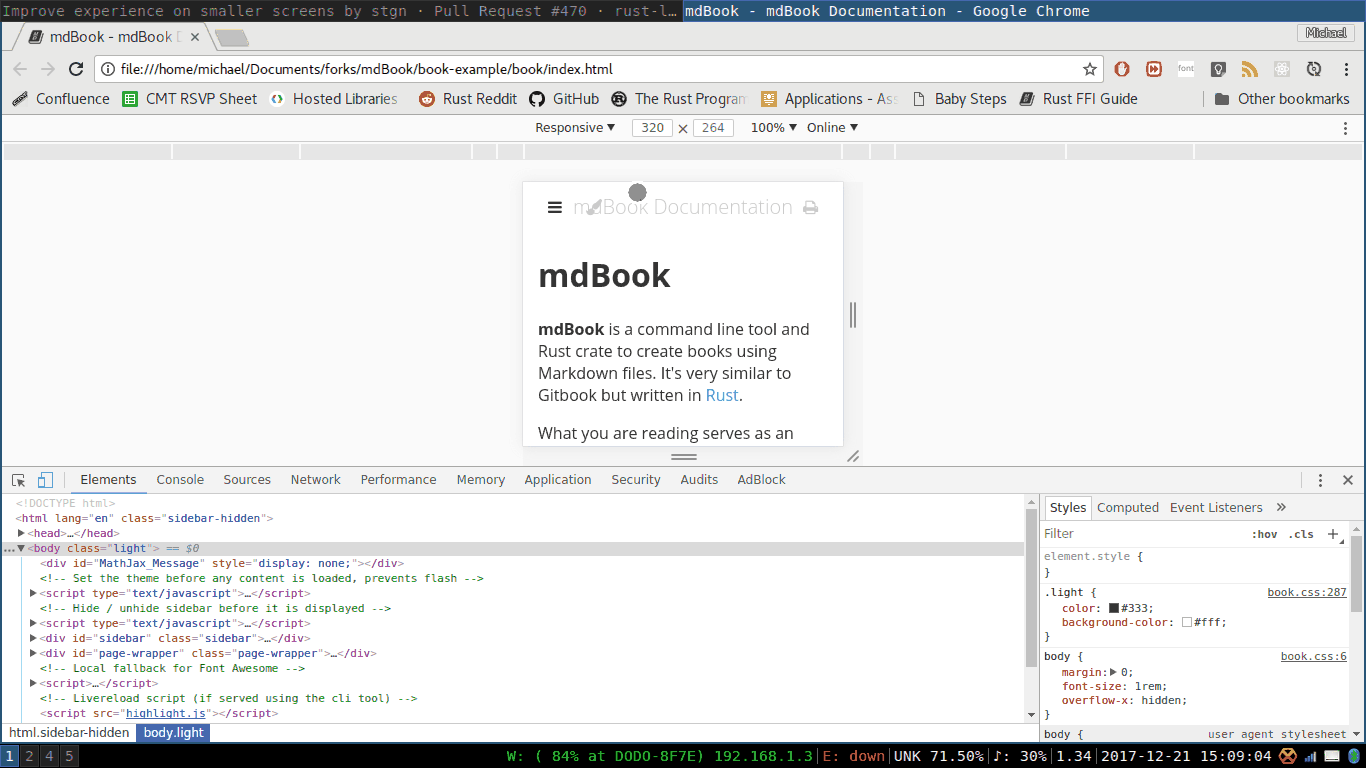
At lower screen widths, when the sidebar is visible or transitioning to/from visible, the page wrapper will attempt to fit within the remaining screen width. On mobile devices, this leads to undesirable line wrapping and overflow. This change sets the width of the page wrapper to be equivalent to the screen width when the screen width is less than the sidebar width plus the maximum content width (1080px), simply causing the sidebar to push the page wrapper off-screen when it is visible.
Before and after:

I also changed some behavior regarding the sidebar's state when the page is loaded. If the screen width is less than 1080px, it will be hidden (so it doesn't load with the content pushed off-screen). Otherwise, it uses the stored value, defaulting to visible if there isn't one.